I still have a „Outlook is a mail client“ idiom deep in my mind. However, it is not an exact label any more. The so-called great Outlook is able to do much more, it doesn’t only receive and send e-mail messages. Apart from the mailbox management, Outlook consists of a calender, planner, task manager and contacts manager.
I wouldn’t be afraid to call the existing Outlook 2007 a transition version between the old Office concept (toolbars and buttons) and the new generation (interface with the Ribbon strip). Original interface of the program was based on toolbars and Outlook 2007 still retained the traditional appearance However when writing a message, you already got glimpse of an interface with a Ribbon tab bar.
Microsoft Outlook 2010
The user interface of the new Outlook 2010 has been fully recreated so that it is in harmony with other MS Office 2010 applications. That means that we will have to get used to the Ribbon even here. Let’s see some of the the new features in detail.
Ribbon tab bar and Backstage mode
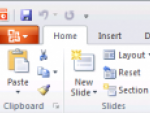
After you launch Outlook 2010, you will see the Ribbon strip immediately in the main window. At the first sight it is clear that more functions fit into Ribbon than into a single standard toolbar of the original Outlook interface. The button for writing a new e-mail is separated from a button for creating new items in the calendar, contact list or task manager. Apart from the New E-mail button, more room was also given to the respective buttons.
An independent Quick Steps section offers functions allowing you to move a message into different folders (which can be also done quicker by dragging the files over), to save it into a calendar as a meeting reminder, to quickly forward it to a chosen person or to more people and to forward it with a FYI note. I am quite curious what names will these function have in the Czech version of Outlook 2010.
Microsoft Outlook 2010
Otherwise the functions of the main window are very similar to the previous Outlook versions, the most significant difference is the Ribbon strip and different layout of the buttons. Another thing I like is a button that allows you to quickly switch the message status between read and unread.
If you are looking for a button for sending and receiving all messages in the Ribbon, you will not succeed. The button is quite small and it is located in the very top left corner. If you want to see it bigger, just switch to the Send/Receive card where you will be able to find a set of other functions connected to mail sending and receipt, such as header minimization, switching between online and offline mode, connection dial-up, download indicator etc.
Microsoft Outlook 2010
The Folder bookmark offers a special function for working with folders. In essence you will find here the same functions that were (and still are) available from the context menu at the list of folders in the left panel, meaning there are buttons for creating a new folder, for creating a search list, for multiple messages labelling, running sorting filters, for erasing, archiving etc.
Microsoft Outlook 2010
View is the last card of the main window. In the MS Office 2010 Technical Preview version Outlook 2010 has not yet been completely finished, many buttons lack proper icons and have only red buttons instead of them. That begs the question what the final appearance of this card will be. For now you can switch between the list of messages and their previews, sort messages according to their date, sender, subject, receiver and other data and to switch the view of the navigation panels.
Microsoft Outlook 2010
The Backstage mode can be called using the brown-orange Office button. It offers functions for mailbox and account management (settings, automated replies, cleaning, filters for sorting), import and export of the account settings and RSS channels, printing, saving of individual messages and of course the settings of the Outlook itself.
New e-mail in Outlook 2010
The window for creating a new e-mail message and for replying in Outlook 2010 doesn’t practically differ from the previous version that has already been equipped with the Ribbon tab bar. The functions for inserting content that allow immediate previews (see above) and the Zoom button that allows you to magnify the message content have been improved.
Just as with other MS Office 2010 programs, the Insert card received a new button for working with screenshots. I think it is very practical here, unlike in Excel for example. If the user wants to send somebody a description of a problem, he or she can easily use this function to capture a window of a different program and insert it into the message as an image.
The Options card provides for faster access to the choice of themes for messages (useful for those who like sending colourful e-mails), it also offers a button for easy background colour change. I have not noticed any other innovations. The Format Text card allows you to quickly switch among the HTML, plain text and Rich Text formats, it also offers a new Editing drop-down button that offers functions for searching and replacing text for case that the window has been scaled down too much for those buttons to be separate.
As with other Office applications, working with images has been considerably improved in Outlook. Their editing is easier, they can be furnished with new effects, cropped into shapes and ratios and their background can be easily removed. In the window for writing a message you will also find the Backstage mode button used for saving and printing messages.
Microsoft Outlook 2010
Outlook 2010 as a calendar
The calendar does not offer many innovations, of course except for the upper part of the Outlook window where you will find the Ribbon strip. The strip offers buttons for creating new records, switching the calendar views and for its sending, sharing or online publication. Probably the only new function is a new view type called Schedule View that shows the planed tasks on a time axis.
Microsoft Outlook 2010
The window for creating a new calendar record is exactly the same as it was in the previous Outlook version, only some of the buttons in the Ribbon strip have been switched. As with other editing functions and with other Office applications, the calendar’s formating has improved, particularly in the field of images and inserting screenshots.
Contacts in Outlook 2010
Again, do not expect any striking changes in the Contacts part. I like the buttons for quick switching among business cards, cards, telephone directory and address book in the Ribbon strip. The window for inserting a new contact retains the Ribbon tab bar and complements it with the Backstage mode.
Task list and Notes
This brings us to the last parts of Outlook – to the Task list and Notes. Before I went over to purely web environment of Live Hotmail and Gmail I used to use the Outlook's task manager extensively. I didn't see many changes in the new environment, however what I found interesting was that Outlook 2010 does not offer inserting a screenshot when entering a new task.
Microsoft Outlook 2010
If I am not mistaken, there is nothing new with the notes creation.
Further innovations and improvements
A list of changes that the new Outlook 2010 offers (there are some more innovations and improvements talked about):
- Conversation view allows you to track the conversation easier.
- New MailTips function warns the users connected to Exchange 2010 that they are about to send a great number of messages to addresses outside their organization Useful for instance with automatic replies or when the button Reply to all has been pressed unintentionally.
- If you use Office Communicator Server R2, Office Communicator 2007 R2 or newer, you can use quick connection to your contacts from the Home bookmark.
- As in other applications, there are some extra themes and SmartArt graphics.
- Calendar sharing and group work.
- Interconnection with Office Communications Server.
- Possibility to receive voice messages and faxes directly into the mailbox with the support of Exchange Server 2010.
- Mobile version of Outlook 2010.
I think that there are more than enough changes in Outlook 2010 and they apply mostly to the user interface. Time will tell, if the new Outlook 2010 is faster and more stable than its predecessor. Do you find it interesting?
Note: Czech version of this article available at První pohled na MS Office 2010 - Outlook 2010.


